What a Small Business Website Needs?
TL;DR A simple, effective small business website clearly explains what you do, who you serve, where you are, and how to work with you. It needs a few core pages, trustworthy branding and photos, clear calls to action, basic security, and search-friendly content. Anything beyond that is optional, depending on your stage of business and budget.
*Some of the links in this post are affiliate or partner links. If you buy through one, I may earn a small commission at no extra cost to you.*
You already know your business matters. Your customers tell you. Your referrals prove it. But when you go to actually get that website live, you hit a wall of tech, templates, and “must-have” features that all seem to cost time or money you do not have.
This is where a lot of heart-led business owners get stuck. You do not need a fancy site. You need a clear, trustworthy one that feels like you, shows people what you offer, and makes it easy to work with you.
I am going to walk you through what a small business website really needs so you can look at your current site, or that template you are eyeing, and say, “Yes, this is enough for where I am,” or “Okay, here is exactly what I need to fix next.”
What a small business website really needs (in plain language)?
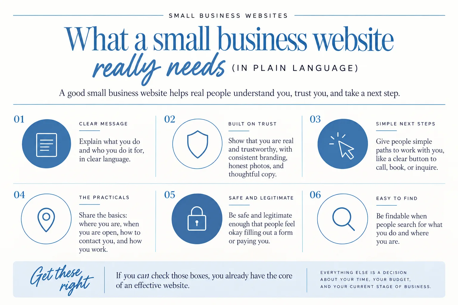
A good small business website is less about fancy features and more about helping real people understand you, trust you, and take a next step.
If we strip it down to the essentials, your site needs to:
- Explain what you do and who you do it for, in clear language.
- Show that you are real and trustworthy, with consistent branding, honest photos, and thoughtful copy.
- Give people simple paths to work with you, like a clear button to call, book, or inquire.
- Share the basics: where you are, when you are open, how to contact you, and how you work.
- Be safe and legitimate enough that people feel okay filling out a form or paying you.
- Be findable when people search for what you do and where you are.
If you can check those boxes, you already have the core of an effective website. Everything else is a decision about your time, your budget, and your current stage of business.

Start with the basics: what every small business website must show on day one
On day one, your website does not need to be perfect. It does need to be clear.
When someone lands on your site, they are usually trying to answer a few simple questions:
- What do you do?
- Is this for someone like me?
- Where are you located?
- How do I contact you?
- How do I get started or book you?
- Can I trust this?
For most businesses, that looks like a few core pages and pieces.
1. A simple, clear home page
Your home page is not a movie trailer. It is more like a front porch and a front desk.
On your home page, someone should be able to see, without scrolling too far:
- A short, clear line that says what you do and for who.
Examples:
- “Family photography for laid-back Lafayette moms.”
- “Bookkeeping support for New Orleans food trucks.”
- A quick snapshot of your main services or offers.
- One clear next step: “View services,” “Book a consultation,” or “Get a quote.”
Farther down the page, you can include:
- A short “about” section that introduces you as a real person.
- A preview of your services, with links to learn more.
- A couple of testimonials or proof points.
- A simple contact or inquiry section.
If your home page is just a big photo and a clever line that could be about almost anything, people will bounce. Clear beats clever every time.
2. A services or “work with me” page
This is where you explain how you help, in normal human language.
Your services page should:
- Name each main service or package.
- Explain what is included in each, in bullet points if possible.
- Share who it is best for, so people can self-select.
- Answer “How does this work?” in a short, step-by-step way.
- Include pricing or at least clear guidance like “starting at…” or “custom quotes available.”
You do not have to list every single option. Most small businesses do better with 2–4 main offers that are easy to understand.
3. A clear contact page
You might already have your phone number on your website, but your contact page is where people go when they are ready to reach out. Make it easy.
Include:
- Your contact form, with only the fields you truly need.
- Your email address typed out so people can copy-paste it.
- Your business phone number, if you take calls or texts.
- Your business hours, especially if you answer the phone or accept walk-ins.
- Your location and a simple map or link to directions if you rely on local, in-person customers.
The SBA guidance notes that people often go to your website looking for contact details, directions for foot-traffic businesses, and social links, so do not hide those pieces on a single tiny icon in the footer. Put them where people expect to see them on your contact page and your header or footer, too.
4. An about page that builds trust
This is not a full autobiography. It is a bridge between “stranger on the internet” and “okay, I feel good trusting you with this.”
On your about page, focus on:
- A short story of how you came to do this work.
- The values that matter in how you run your business.
- What makes you a good fit for your ideal client.
- A photo or two of you, so people can see who is behind the business.
If you feel awkward writing about yourself, think of the conversation you would have if a friend introduced you to a great-fit client at a coffee shop. What would you say first?
5. Basic legal pages
Even a simple site needs a few legal basics. At minimum, most small businesses should have:
- A privacy policy, that explains what information you collect (like contact form submissions or email signups) and how you use it.
- A cookie notice if your site uses cookies in a way that requires it, especially if you are using certain analytics or marketing tools.
You can use a generator or talk with an attorney for your specific situation. The key thing is to not ignore this completely, especially once you start collecting leads or taking payments online.
6. A place to collect leads
If you want to keep in touch with visitors who are “not ready yet,” your website should include a way to collect leads, usually with an email marketing tool.
That might look like:
- A simple newsletter signup box in your footer.
- A free guide or checklist in exchange for an email address.
- A “waitlist” or “be the first to know” form for services that book up.
You can do this with an email marketing platform like Flodesk. I use Flodesk in my own business and recommend it to clients.
7. A platform that fits how you actually work
There are many website platforms out there, and the options can feel like alphabet soup.
For many new or growing small businesses, Showit is a strong option. It uses a drag-and-drop builder that feels more like designing a flyer than writing code, which can feel less intimidating if you are not techy. You can also find a lot of Showit templates designed specifically for service providers and creatives, so you are not starting from a blank page.
Whatever platform you choose, look for one that:
- Fits your comfort level with tech.
- Plays well with the tools you need, like scheduling, online payments, or email marketing.
- Lets you update the basics on your own when you need to.
If you feel stuck at this choice, you are not alone. I offer coaching calls where we walk through how your business runs and which platform fits, and I can coach you on DIYing your site so you are not guessing. You can book that through my main site.
For some early-stage businesses, something like a one-page Mini Site is the right starting point while the rest of your brand grows.
Make it easy to trust you: branding, text, and photography
People decide quickly whether they trust a new small business online. Your logo, colors, and fonts should look consistent and intentional without feeling stiff. Your words and photos finish that first impression.
You do not need a massive rebrand to build trust. You do need a site that feels like one business, not five different moods.
Why consistent branding matters?
Consistent branding tells visitors, “This person has their stuff together.”
That means:
- One logo (or simple text logo) used the same way across your site.
- A clear color palette that repeats instead of changing every section.
- Two or three fonts, used consistently for headings, body text, and accents.
When your branding feels all over the place, even if someone cannot name why, they feel unsure. When it feels consistent, they feel like you are established and serious about your work.
Website text that sounds like you, but clearer
Website text is just the words on your website. Good website text does two things:
- Reflects how you naturally talk.
- Cleans it up so it is clear and easy to skim.
Some quick tests:
- Can a first-time visitor understand what you do in the first 5–10 seconds?
- Are your headings clear, not just clever?
- Do you answer the questions people always ask you in DMs or on the phone?
I often see DIY sites where the business owner has poured their heart into the words, but important details get buried or repeated. Editing down can build just as much trust as adding more.
Honest photos that feel like your real business
Photos are usually the first thing people notice, before they read a single sentence.
Strong website photos:
- Look like your real work and your real space, not random stock people.
- Are well lit and clear.
- Match your brand’s mood and colors.
If you are a service-based business in Lafayette, Baton Rouge, or New Orleans, having photos that actually show you in your space, or working with clients, can make a huge difference. I offer brand photography and video for Louisiana businesses for exactly this reason.
A real example: Samantha’s DIY site refresh
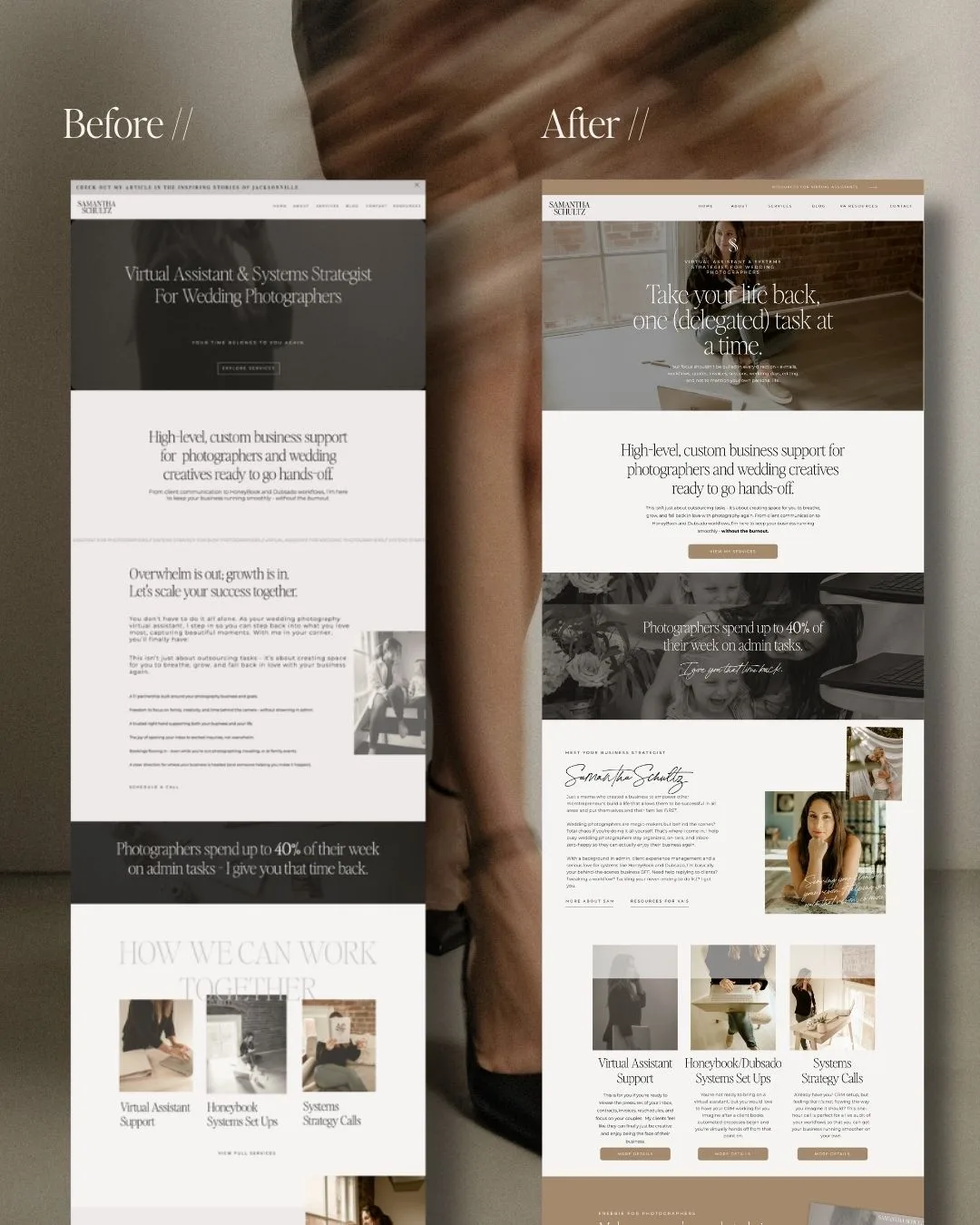
Samantha Schultz is a virtual assistant for wedding photographers. She did a pretty great job DIYing her site at itssamanthaschultz.com. Her personality came through, and the core info was there.
But when she came to me, her site:
- Felt unorganized.
- Had a lot of text that felt out of place.
- Was harder to skim than it needed to be.
We booked a VIP day and I redesigned each page. I added her new branding photos, simplified her layout, and tightened up the words on each page so it was easier to read and more focused on how she helps her clients.
In the before-and-after of her website side by side so you could clearly see the difference in layout and clarity.
The result was not more “fancy.” It was more focused. That is what most small business sites need.
Turn interest into action: calls to action, forms, and booking paths
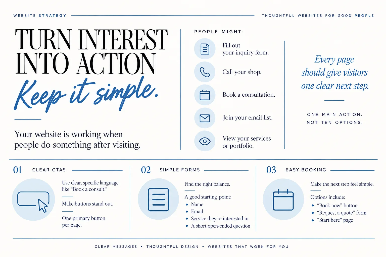
Your website is working when people do something after visiting. That “something” does not have to be buying immediately. It might be:
- Filling out your inquiry form.
- Calling your shop.
- Booking a consultation.
- Joining your email list.
- Viewing your services or portfolio.
Every page should give visitors one clear next step. Not ten options. One main action.
Clear, simple calls to action
A call to action (CTA) is just the invitation to do that next thing.
Good CTAs are:
- Clear: “Book a consult,” “Get a quote,” “View services” instead of “Learn more” everywhere.
- Visible: buttons that stand out, not just text links.
- Focused: each page has one primary button, not three competing choices.
Think of it like guiding someone through your shop. You would not point at five doors and say, “Go wherever!” You would say, “Let me show you this first.”
Forms that do not scare people off
Your inquiry or contact form is where a lot of potential business falls through the cracks.
Keep your forms:
- Short enough that people do not give up halfway.
- Long enough that you get the information you need to respond well.
A good balance for most service providers is:
- Name
- What service they are interested in
- A short open-ended question like “Tell me a bit about what you are looking for”
You can always ask more detailed questions after they reach out.
Booking paths that match how you work
If you book appointments, classes, or calls, your website should make that process feel simple.
Options could include:
- A “Book now” button leading to your scheduler.
- A “Request a quote” form if your work is custom.
- A “Start here” page that explains your process and links to the right form.
When I create clients sites, I make sure that on each page there is a clear path to the main action, not just a link stuffed in the footer.
Ask yourself: “If someone is ready to work with me right now, how many clicks does it take from my home page?” Aim to make it two or fewer.
Look credible and secure: domains, hosting, and basic website safety
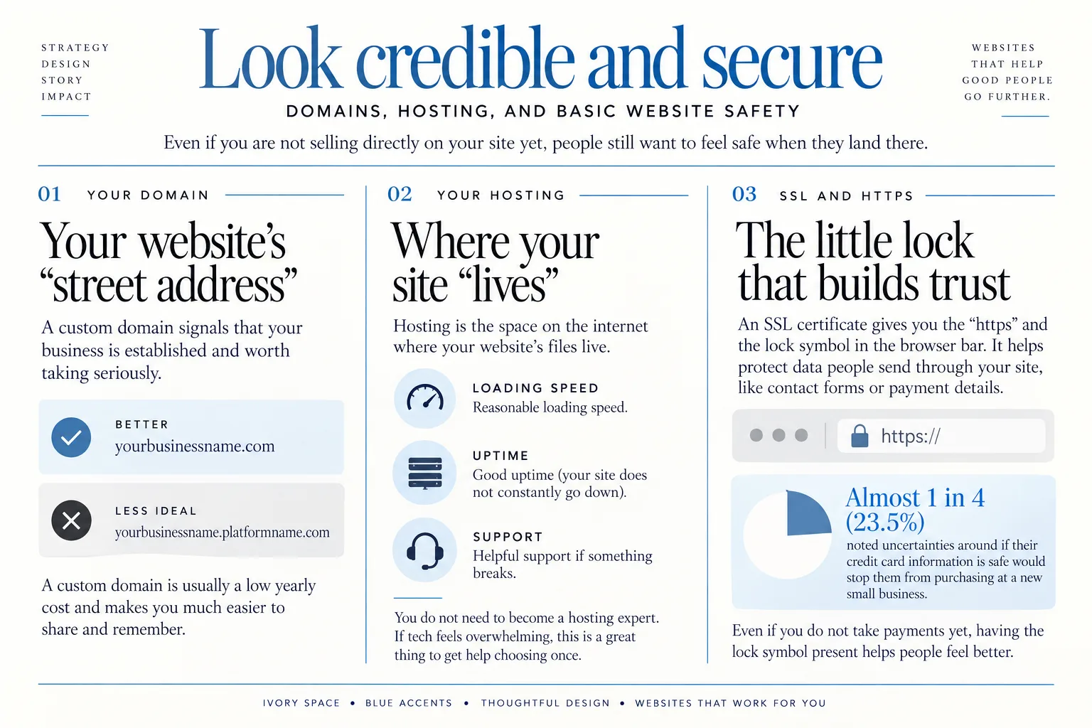
Even if you are not selling directly on your site yet, people still want to feel safe when they land there.
That safety feeling comes from a few behind-the-scenes pieces:
- Your domain
- Your hosting
- Your SSL certificate (the little lock symbol in the address bar)
Your domain: your website’s “street address”
Using your own custom domain (instead of a platform-branded one) signals that your business is established and worth taking seriously.
For example:
- Better:
yourbusinessname.com - Less ideal:
yourbusinessname.platformname.com
A custom domain is usually a low yearly cost and makes you much easier to share and remember.
Hosting: where your site “lives”
Hosting is just the space on the internet where your website’s files live. Some platforms include hosting, some require you to buy it separately.
You do not need to become a hosting expert. You do want:
- Reasonable loading speed.
- Good uptime (your site does not constantly go down).
- Helpful support if something breaks.
If tech fully overwhelms you here, this is a great thing to get help choosing once, instead of constantly guessing.
SSL and HTTPS: the little lock that builds trust
An SSL certificate is what gives you the “https” and the lock symbol in the browser bar. It helps protect data people send through your site, like contact forms or payment details.
Security is not just a tech concern. It directly affects whether some customers will buy from you. In research shared by GoDaddy, almost 1 in 4 (23.5%) noted uncertainties around if their credit card information is safe would stop them from purchasing at a new small business. You can read more about that here.
Even if you do not take payments yet, having that lock symbol present helps people feel better when they fill out a form or share basic information.
Help people find you: search-friendly foundations for small business sites
You do not have to become an SEO pro to help your website be findable. The foundation is simple:
Foundational search-friendliness is about making it clear to search engines and humans what you do, who you serve, and where you are based, not chasing algorithms.
Start with your basics: what, who, where
On your site, especially your home and services pages, make sure you are clearly stating:
- What you do (“wedding photographer,” “bookkeeper,” “catering company”).
- Who you serve (“New Orleans couples,” “Lafayette creatives,” “small restaurants”).
- Where you work (“serving Lafayette, Baton Rouge, and New Orleans”).
This is not about stuffing keywords. It is about saying in plain language what someone might type into Google when they need you.
Use clear page titles and headings
Page titles and headings help both people and search engines understand your content.
Instead of:
- “Welcome” as your home page title
Try:
- “Family photographer in Lafayette, Louisiana”
- “Bookkeeping for small businesses in Baton Rouge”
Keep your headings honest and descriptive. Each main section on a page should have a heading that says what is there. Avoid headings that are clever but vague.
Add your basic business details in consistent places
Make sure your:
- Business name
- Address (if you have a physical location)
- Phone
Appear in the footer or contact page in a consistent format. This helps people and certain business listing tools recognize you.
A quick note on how common websites are now
Having a website is no longer a “nice to have.” In one survey from the Canadian Federation of Independent Business, 78% of surveyed small firms reported that they have a company website. That information is shared here.
You do not need a huge site. You do need to be findable and clear when someone looks you up.
If you want to go a bit deeper into tools and platforms that play nicely with small business websites, my article on how I use Thrivecart as a Showit web designer and business coach may be a helpful peek behind the scenes: Learn How I Use Thrivecart As A Showit Web Designer And Business Coach.
How to decide between DIY, a template, or hiring a web designer?
Once you know what your site needs, the big question becomes how to build it.
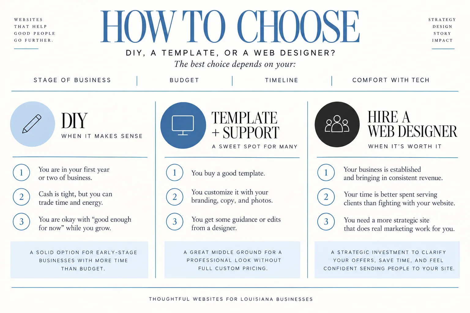
There is no one right answer. The best choice depends on your:
- Stage of business
- Budget
- Timeline
- Comfort with tech
DIY or template-based sites can work well for very early-stage businesses with more time than budget, as long as they still include the essentials covered in this article.
When DIY makes sense?
DIY is a good fit when:
- You are in your first year or two of business.
- Cash is tight, but you can trade time and energy.
- You are okay with “good enough for now” while you grow.
If you go this route:
- Choose a simple template, not something wild and complex.
- Prioritize clarity over fancy animations.
- Use real photos of you and your work as soon as you can.
- Stick to the basic pages we talked about earlier.
Getting a bit of targeted help, like a one-time coaching call, can save you weeks of trial and error. I offer this for business owners who want to DIY but do not want to figure it all out alone.
When a template plus light support is a sweet spot?
Many small businesses land here:
- You buy a good template.
- You customize it with your branding, copy, and photos.
- You get some guidance or edits from a designer.
This route works well if:
- You want a professional look without full custom pricing.
- You can handle some tech tasks, but not all.
- You are ready to book clients and want your site to reflect that.
The Mini Site is built for this kind of season, when you need something focused and clear without committing to a huge build.
When hiring a web designer is worth it?
Hiring a designer is worth considering when:
- Your business is established and bringing in consistent revenue.
- Your time is better spent serving clients than fighting with your website.
- You need a more strategic site that does real marketing work for you.
A done-for-you website can help you:
- Clarify your offers and messaging.
- Save hours every month on back-and-forth questions.
- Feel confident sending people to your site, instead of apologizing for it.
If you are a business looking for more support, I offer small business website design services that pair design, copy guidance, and photography to create a site that actually fits how you work.
Match your website to your current stage of business
You do not need a giant site on day one. You also do not want to stay stuck on a half-finished DIY forever if your business has grown beyond it.
Here is what “enough” can look like at different stages.
Early-stage: testing your offers
If you are in your first year or so:
- A streamlined one-page or small site that clearly explains what you do, shows your work, and makes it easy to contact you is usually enough.
- Focus on:
- A clear hero section (what you do, for who, where).
- A short services section.
- A simple about section.
- A contact form.
- Use this stage to learn: what questions do people still ask after reading your site?
Templates and DIY are very workable here, especially with light coaching.
Growing-stage: refining your services
Once you have more clarity and consistent clients:
- Expand your services into separate pages if you offer distinct things.
- Add more detailed FAQs where needed.
- Strengthen your portfolio or gallery to show your best work.
- Start collecting testimonials and placing them strategically.
You may outgrow your original DIY template here and start wanting something more tailored. That is normal.
Established-stage: optimizing and delegating
If you are established and booked regularly:
- Consider if your website matches the level of your service.
- Look at where people drop off or get confused.
- Update your copy and photos so they reflect your current pricing and process.
- Get help with ongoing improvements instead of holding everything yourself.
At this stage, many business owners decide their website is not a project anymore. It is a living asset that needs care, just like any other part of their marketing.
FAQ: Common questions about small business website design
How much does a small business website cost, and how long does it take?
Costs and timelines vary widely. A DIY site on a template might cost you mostly time and a platform subscription. A custom site with a designer will cost more but save you a lot of that time.
No matter your budget, a functional site must still include:
- Clear explanation of what you do and who you serve.
- Basic pages like home, services, about, and contact.
- Trust-building branding, copy, and photos.
- Simple calls to action and forms.
- Basic security (custom domain and SSL).
- Some search-friendly basics like clear titles and headings.
Your budget and timeline change *how* those pieces get created, not whether you need them.
Can I really build a simple website myself?
Yes, many small business owners build simple, effective sites themselves, especially early on.
A few tips if you DIY:
- Pick a user-friendly platform and a clean template.
- Write your copy in a doc first, then paste it in.
- Keep your color palette and fonts minimal and consistent.
- Start with the required pages, then add more over time.
Hiring help can shorten the learning curve and help you avoid common pitfalls, like confusing layouts, unreadable fonts, or forms that do not actually send anywhere. Even a one-time coaching call to review your DIY site can make a big difference.
Do I still need a website if most of my clients come from social media?
Social media is great for visibility and connection, but it is not your home base. Algorithms change. Accounts get hacked. Platforms fall in and out of favor.
Your website is where:
- You control the experience and the information.
- People can find you even if they are not on your favorite app.
- You can share details that do not fit in an Instagram caption.
Think of social media as the party and your website as your home. You can meet people on social, but you want a place to invite them back to when they are ready to book or buy.
Is there demand for web design and are there legal things I should know before I build?
There is ongoing demand for web design because almost every legitimate business is expected to have a website now. But that does not mean everyone needs a huge custom build.
On the legal side, at a basic level for planning your site you should:
- Include a privacy policy and cookie notice where needed.
- Be honest and clear in your offers, prices, and testimonials.
- Use photos and content you have the right to use.
If you want to explore web design as a business yourself, I share more about that journey here: Become A Showit Web Designer And Build A Business From Home.